
Visual • UX • UI
Benefit Data Trust Design System
Overview
At Benefits Data Trust, we needed a single source of truth to guide our user experience design moving forward. As a result, we created the BDT Design System to provide a consistent and cohesive experience across our growing suite of digital tools.
I’d appreciate you reading the entire case study below, but if you’d like to jump to the end, here’s a link to our live documentation website.
Role
As UI Design Lead, my role was to direct the development and implementation of our design system, ensuring that it aligns with our organization's brand and product vision by:
Engaging key stakeholders to gather requirements
Establishing and maintaining the design system standards and documentation, including accessibility requirements
Collaborating with our Front-End Engineering team to oversee the development and implementation
Training others on how to use the design system effectively
Discovery
To kick off our project, we began a discovery phase to understand our current design process, identify problem areas, and gather requirements. We conducted a visual audit to document the current state of our digital tools, gained insights by researching industry-leading design systems, and defined what we hoped to achieve with ours.
Conduct a Visual Audit
Conducting a comprehensive audit of our digital tools, we identified all the design patterns and components in current use. This audit helped us identify redundancies and, most notably, inconsistencies in the current design approach.

Our content audit illustrated just how fragmented and inconsistent the UI was across, and even within, our digital tools.
Create a Benchmark
To ensure that our design system project was effective, we studied some of the most recognized design systems. While we referenced countless systems, we established three as our go-tos:
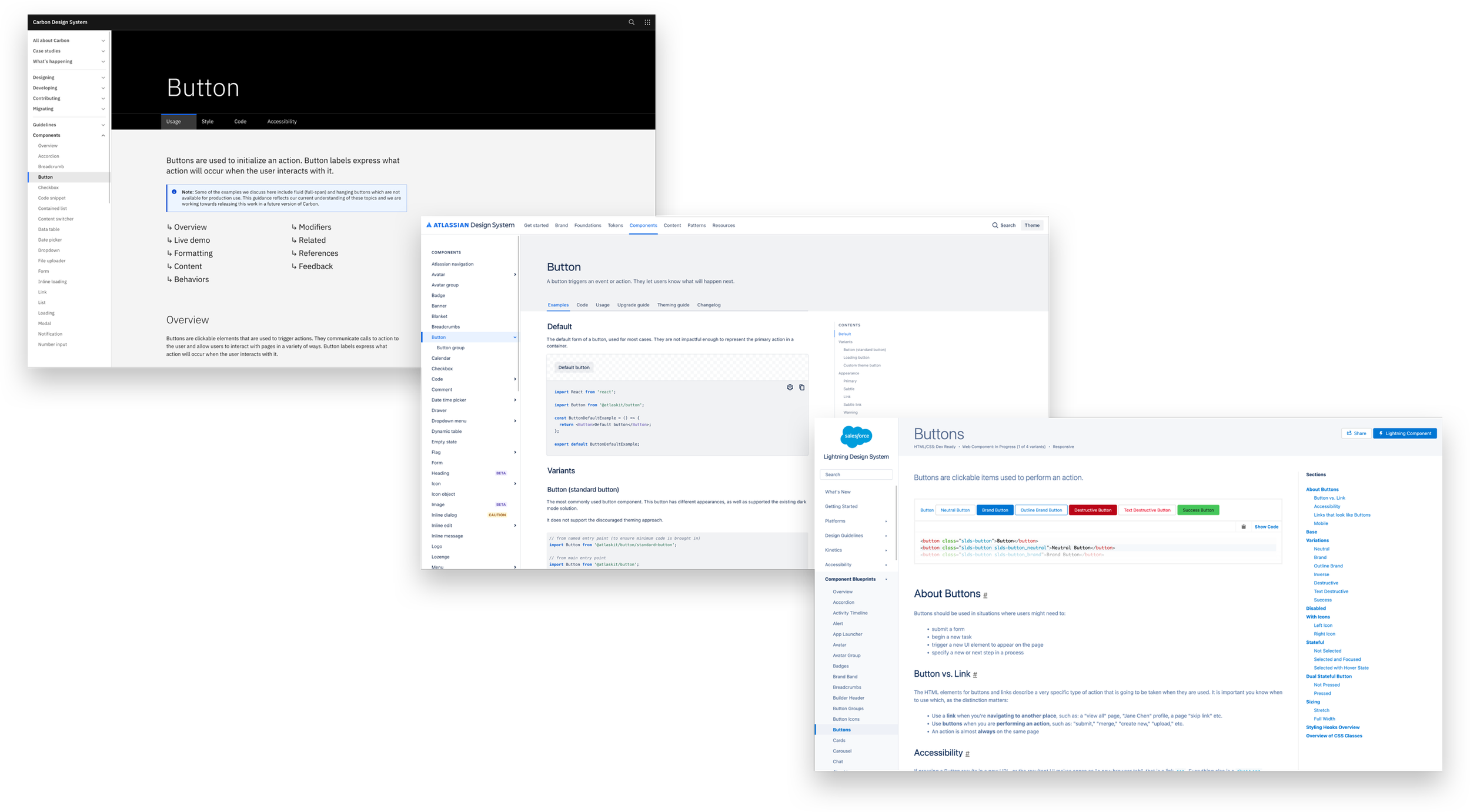
An example of a button component page in each of our referenced design systems.
We analyzed the following aspects of each design system:
Visual Language: We looked at the overall visual language of each design system, including typography, color schemes, and iconography.
Component Library: We examined the library of components provided by each design system, including buttons, forms, and typography.
Documentation: We looked at the quality and depth of the documentation provided by each design system.
This benchmarking helped us understand the best practices in the industry, and although dwarfed in scale, we ensured that our design system was aspiring towards other leading systems.
Define Our Goals
Our design system needed a set of core principles to help us define our mission, guide our decision making during the design process, and communicate value to our stakeholders:
Consistency: Our design system ensures that all of our digital tools adhere to the same design standards, creating a cohesive and consistent user experience. This consistency helps our internal and external users navigate between different tools with ease, and can lead to improved customer satisfaction.
Efficiency: Our design system saves us time and resources by streamlining the design and development process. Designers and developers can reference the design system components and documentation, reducing the need for redundant design work and enabling faster product development.
Scalability: Our design system can be scaled to meet the needs of our growing organization and digital tool suite. As new digital tools are added, the design system can be updated and expanded to accommodate new requirements, ensuring a consistent user experience.
Branding: Our design system ensures that all our digital tools reflect the organization's brand identity, helping to build brand recognition.
Accessibility: Our design system promotes accessibility by providing guidelines and components that adhere to accessibility standards, ensuring that all users can access and use our digital tools.
Overall, we tried to communicate how our design system could bring significant value to our organization by improving the user experience, increasing efficiency, promoting scalability, strengthening branding, and supporting our accessibility goals.
Design
From the discovery phase findings, we began to design the product's visual language, defining our look and feel, and then created a library of reusable components, such as typography, buttons, and form elements.
Color
Color in our design system communicates meaning, creates visual interest, establishes brand identity, and improves the user experience by guiding user attention and understanding. The goal was to create a color palette that provided a consistent and purposeful visual language.
We started constructing our color palette with primary colors. These colors represented our brand identity. We needed a more consistent gradient of values, while establishing a key color to represent primary actions in our UI.
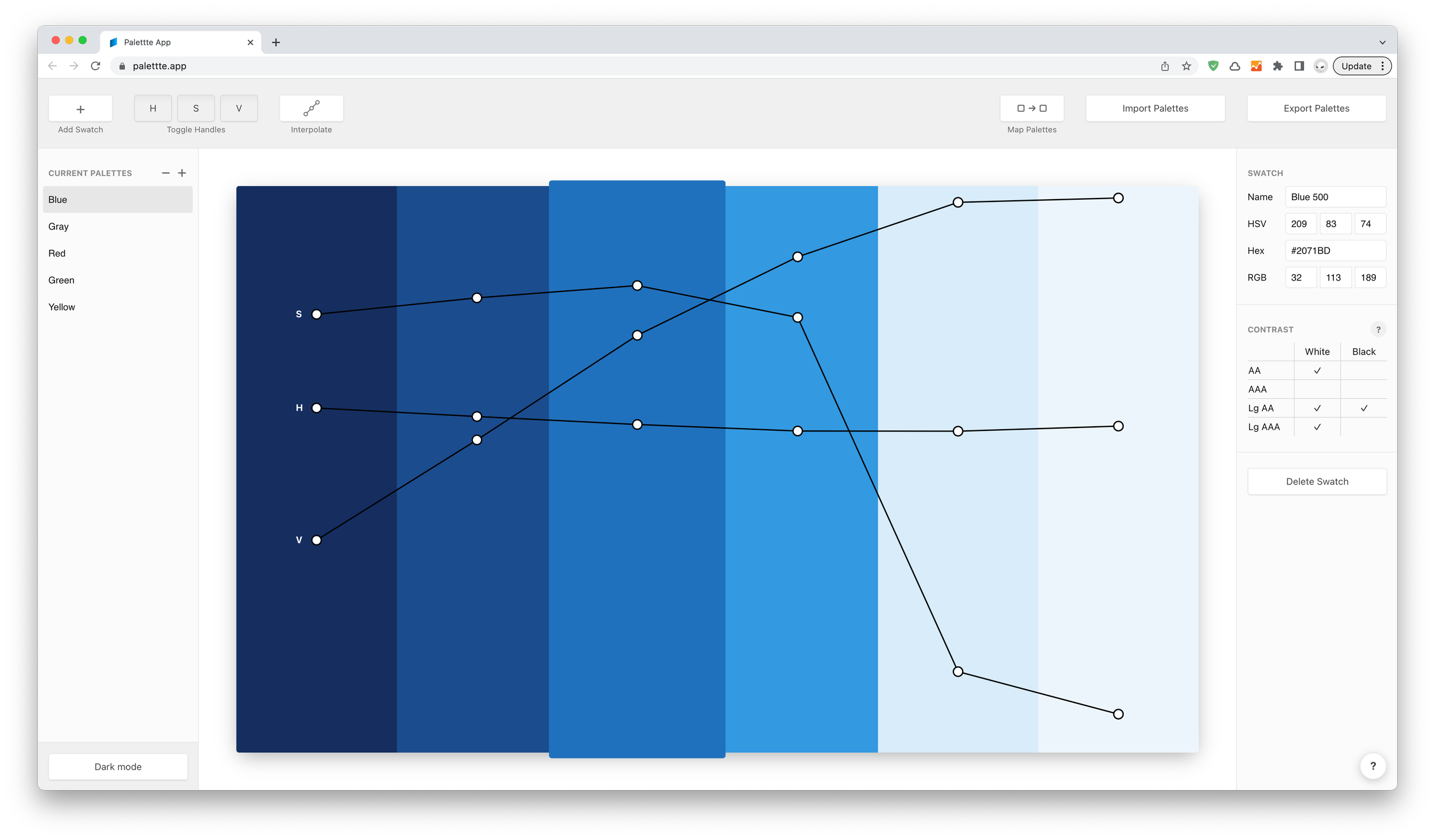
Our primary blue color palette in one of a number of tool we used to generate it. Highlighted you can see our Blue 500 color that become our key value.
The second half of our primary palette is a set of neutral grays; they’re used to balance our attention-grabbing blues.
We finished with our semantic color palette. These colors convey meaning and rely on thier connotation to communicate to users. We needed enough shades and tints to give us the flexibility to reach our accessibility standards.

Colors are broken down into our two categories, Primary and Semantic.
We chose to name our colors with a combination of their hue and a numerical value representing their relative lightness/vibrance (i.e. Blue 500, Red 100). We elected for this naming convention over functional names (i.e. Primary 500, Error 100), relying on our documentation to communicate usage, rather than embedding it in the names.
Our color palette helped our design system a brand identity, enhance the user experience, and support our UI goals. By using color consistently and purposefully, we can create a cohesive and effective visual language.
Sizing & Spacing
Our sizing and spacing guidelines provide our designs with consistency and reduce the decisions designers must make while building new components and pages. We broke these guidelines into three core areas:
Grid & Layout
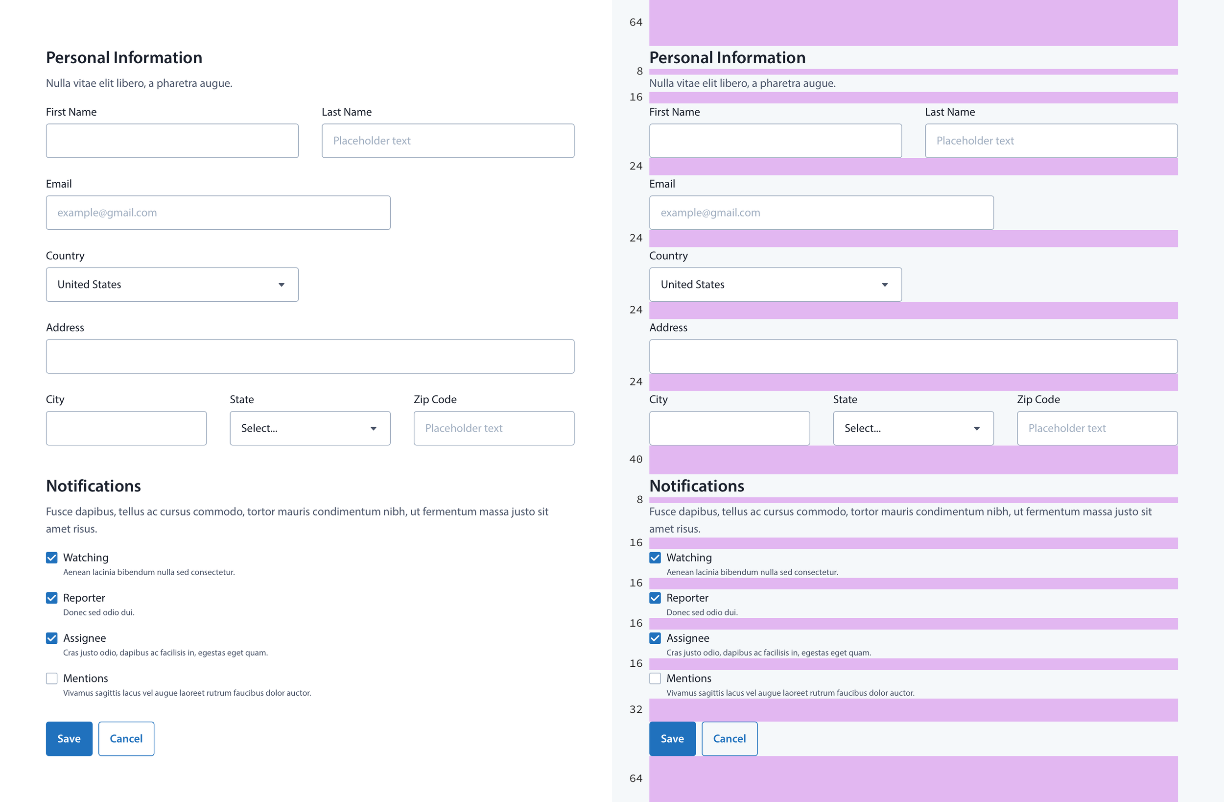
Our baseline grid provides the foundation for all our sizing and spacing guidelines. We chose an 8pt baseline grid, with 4pt increments for finer adjustment. The 4pt/8pt grid is very well-established and researched. It's highly recommended for many reasons, from its versatility in scaling across many screen resolutions, to its relationship with the 16px browser default base font-size.

The 8pt grid we use in Sketch to guide our work.
In addition to our baseline grid, our column layout provides the structure on a page level, allowing us to assemble multiple UI elements. We chose a 12-column layout, another UI standard, providing the maximum number of column configurations.
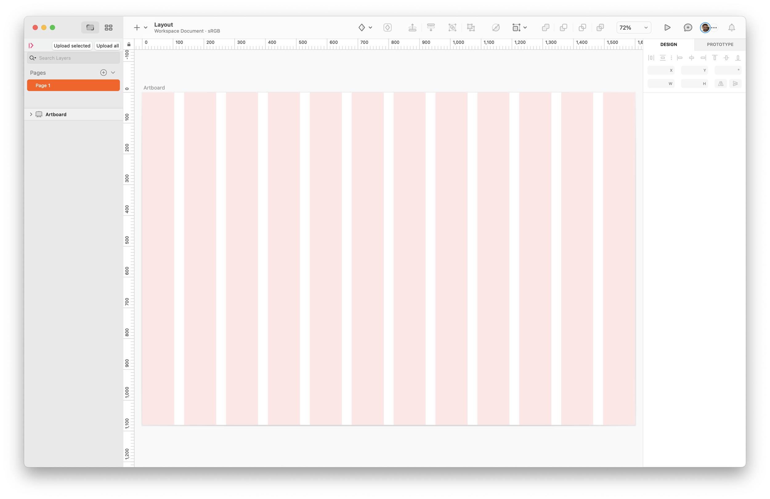
An example of our 12-column layout on a default Artboard
Size & Scale
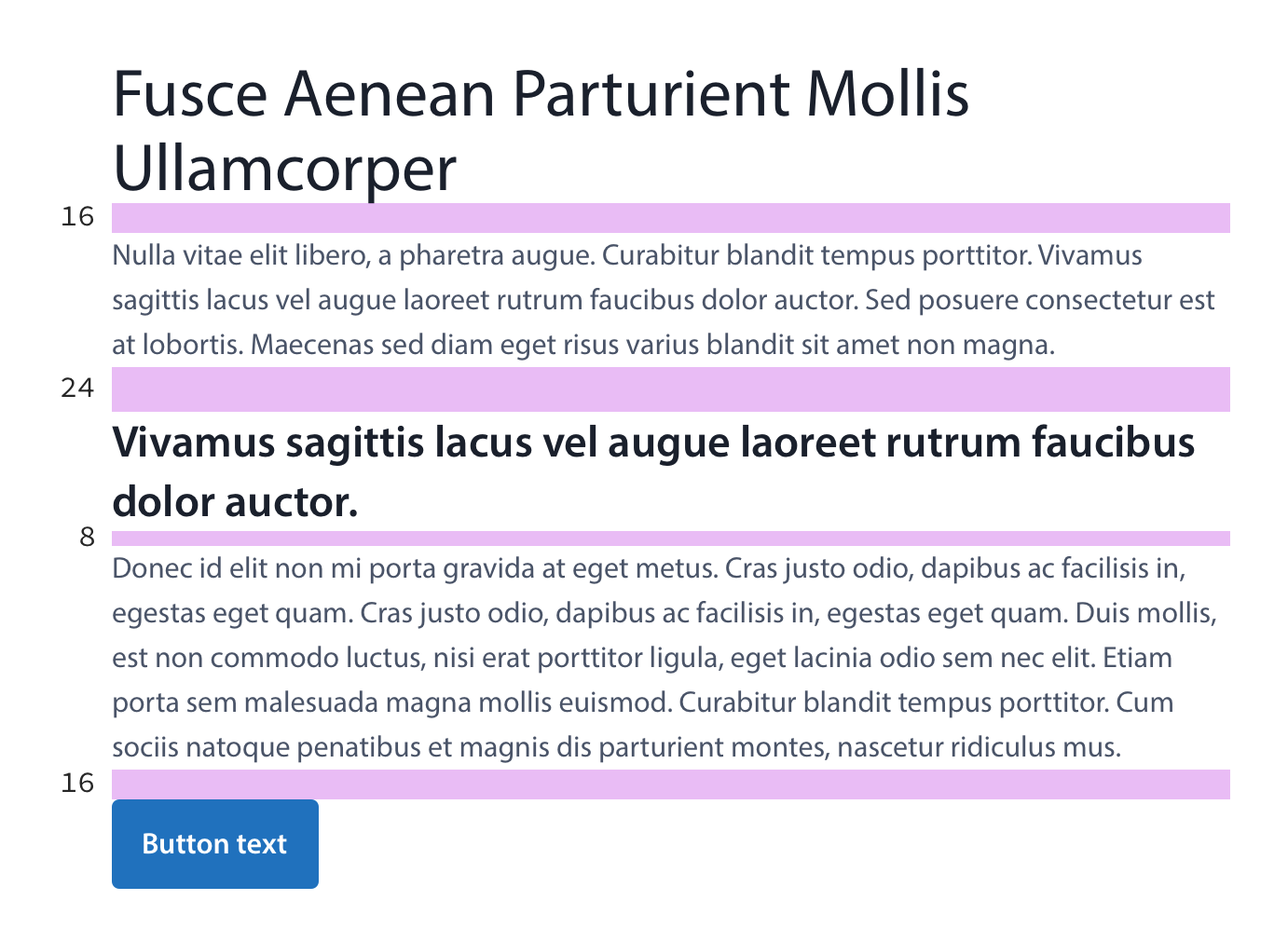
Using our 8pt baseline grid, we established a set of values that, when combined, provide order, visual hierarchy, and consistency to typography and other UI elements.

A visual representation of our standard spacing sizes.
Space
Spacing encapsulates the padding around and the margin between UI elements. Consistent spacing can create a predictable visual rhythm, build relationships between content, and provide helpful context by creating visual groups.
Typography
Our Product font is Myriad Pro, a neutral, general-purpose typeface that can fulfill a range of uses. Myriad Pro was already in use across several BDT digital tools, and given its timeless design, we didn't see any reason to replace it.

A Myriad Pro type specimen.
Readability & Accessbility
Readability and accessibility was our top priority while defining our typography guidelines.
Starting with color contrast, we ensured that we were only using and recommending color combinations that passed WCAG 2.0 level AA which requires a contrast ratio of at least 4.5:1 for normal text and 3:1 for large text.

Creating a WCAG contrast ratio color matrix of our primary brand colors enables designers to quickly select and implement accessible color combinations.
After ensuring a proper contrast ratio, we addressed the second readability pillar, line length. Inspired by Atlassian's Design System, we created a character count guide for optimal line lengths.

Our guide provides optimal line lengths for our two body type styles.
Scale
Finally, we created our final typography scale utilizing our previously mentioned size and scale definitions.

Our final typography scale, including weight, font-size, and line-height.
Iconography
We broke our Iconography into two categories, standard and isometric. You could imagine these as Product and Marketing icons, but they get used across both functional areas. Our standard icons are simple and provide utility, while our isometric icons are more detailed and expressive.
A sample of our standard and isometric icons.
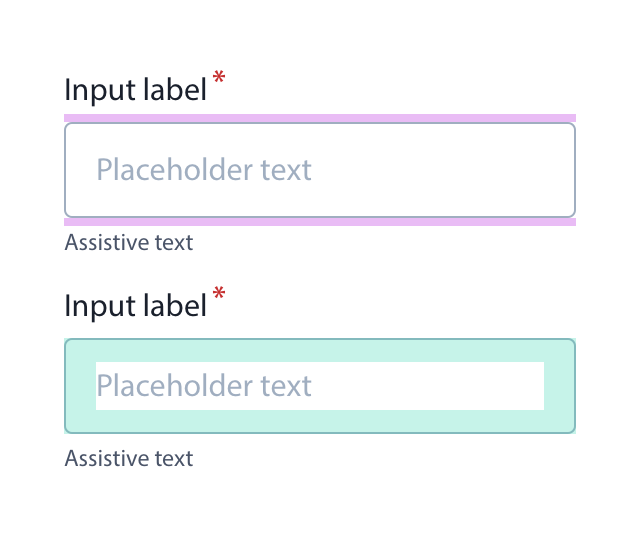
Components
Our component library, or UI Kit, results from all the foundational work that has preceded it. These building blocks combine to create the screens of our digital tools and user experiences.

A small sticker sheet of some our of core components.
Taking an Atomic-like design approach, we started with our most foundational elements and moved through the increasingly more nuanced ones.

An effort to illustrate our atomic approach to components and their usage.
Our goal was to create a library of accessible and aesthetic UI components that could solve any problem we'd require.
Build
Once the design system was complete, we collaborated with the front-end engineering team to implement it, providing them with all the necessary design assets and documentation and ensuring they knew how to use them.

Designing Our System
Sketch
At BDT, our design tool of choice was Sketch. Sketch provides a wide range of features and tools that are tailored for creating design systems.

Each component in our Sketch Library has its own page, laying out all of the available options.
Key Sketch features:
Components: Sketch allows users to create and organize components, symbols, and styles within a shared library, making it easy for other designers to access and reuse those elements in their designs.
Documentation: Sketch can be used to create and organize documentation assets within the design system library, allowing for easy access and reference by anyone on the team.
Collaboration: By allowing multiple users to collaborate effectively, Sketch enables designers to work in real-time on a single design file, reducing the potential for conflicts and inconsistencies.
Integration: Integrating with other design system tools such as zeroheight, Sketch allows designers to seamlessly transfer our assets, styles, and components, streamlining the design system development and maintenance process.
Sketch, and other top design tools like Figma, are essential for developing and maintaining design systems. They provide a collaborative, organized, and efficient environment for teams to create and store design components and documentation.
Creating Documentation
zeroheight
For our design documentation home, we chose zeroheight. zeroheight is a powerful documentation tool that allows us to maintain and communicate our design system. The value proposition of zeroheight also aligned nicely with Sketch.

zeroheight allows us to translate our Sketch documents into development ready documentation.
Key zeroheight features:
Documentation: zeroheight’s WYSIWYG interface provided an intuitive space for designers to create and maintain our documentation, including annotations and notes to provide additional context.
Collaboration: zeroheight allows multiple team members to contribute to the documentation. Designers and engineers can provide feedback, suggest changes, and review updates to the documentation in real time, ensuring that the documentation remains up-to-date and accurate.
Integration: zeroheight integrates with Sketch and Storybook, our team’s preferred component repository. This allows designers to easily import and sync design system components, styles, and documentation with zeroheight. While also providing a place for engineers to embed stories from Storybook, showcasing interactivity and other component-specific features.
Versioning: zeroheight allows users to track and manage changes to the design system over time, providing versioning capabilities that ensure the documentation accurately reflects the current state of the design system.
zeroheight is a powerful tool for managing and documenting design systems in one place. It makes creating, maintaining, and sharing design system documentation easy for both internal and external teams, improving collaboration and communication.
Testing and Maintaining Our Code
Storybook
Storybook is an interactive directory of UI components. Storybook played a critical role in supporting the development and maintenance of our design system.

Each component in our library has a Story showcasing an interactive preview, sample React code and available props.
Key Storybook features:
Component Library: Storybook allows designers and developers to build and organize a comprehensive library of design system components in a single location. This library provides a single source of truth for design system components.
Interactive Component Testing: Storybook enables designers and developers to test and refine design system components in a real-world environment. This testing ensures that design system components are consistent, responsive, and accessible, improving the overall quality of the design system.
Documentation: Designers and engineers can use Storybook to create interactive examples of design system components, include annotations and notes, and organize documentation pages into a hierarchy.
Collaboration: Storybook enables designers and developers to work together effectively by providing an environment for designers and developers to see the same components, styles, and documentation, reducing the potential for conflicts and inconsistencies.
Integration: Storybook integrates with many javascript libraries such as Vue, Angular, or our language of choice React, allowing engineers to easily import and sync design system components, styles, and documentation.
Storybook provides an isolated environment to house components, facilitate interactive testing, support collaboration, and integrate with other design system tools throughout the development process.
Results
In late 2022, we began the process our building our next generation of benefit screening tools at Benefits Data Trust. During this time, our design system has significantly impacted our design process. It improved the efficiency of our work, reduced design inconsistencies, and enabled designers to focus more on creating new features rather than recreating existing components. The design system has also improved our collaboration between designers and engineers, providing us with a shared language and understanding of our digital tool's visual and interactive design.